Getting Start
Open project
After launching the FairyGUI editor, the welcome window is displayed first:
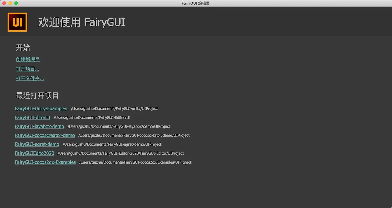
Create new projectClick to display the dialog box for creating a project.Open projectOpen an existing project by selecting a project description file xxx.fairy.Open folderOpen an existing project by selecting the directory where the project is located. If your project is a project created in version 2.x, you can only open it with this menu.Recently opened projectItems that have been opened can be clicked directly from the list to open them. Click the X on the left to delete the history, but it will not delete the contents of the project.
The editor supports opening multiple projects at the same time. On Windows platforms, multiple FairyGUI editors can be launched by double-clicking the icon on the desktop repeatedly. On the Mac platform, you can open a project, then click the main menu "File"-> "New Window", and then open other projects.
Create new project
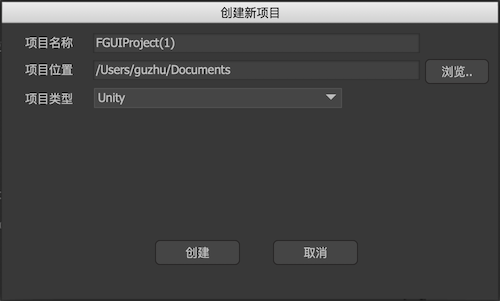
Creates a new UI project at the specified location.
project nameproject name. You can use Chinese, and you can modify it after you create it.Project locationProject location. Note: Please do not use paths with Chinese characters.project typeUI project type, that is, the platform on which the UI actually runs. Different platforms have certain differences in display effects and release results. But don't worry about choosing the wrong project type here. You can adjust the UI project type at any time after the project is created. The operation location is in the menu "File-> Project Settings".
The structure of the FairyGUI project in the file system is:
assetsPackage content placement directory.package1One directory per package. The directory name is the package name.
assets_xxBranch content directory, xx is the branch name. Multiple branches have multiple directories with similar names.settingsThe directory where the configuration files are placed..objsInternal data directory. Note: Do not join version management, because the content here does not need to be shared.test.fairyProject identification file. The file name is the project name and can be modified at will.
Main interface
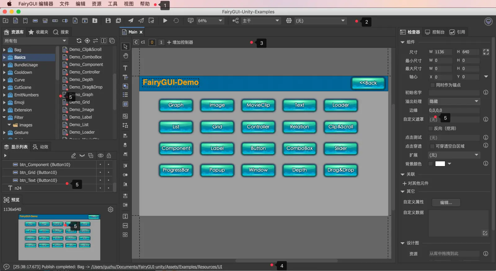
The editor's main interface consists of the following parts:
- main menu. On Mac, the main menu is integrated with the Mac application menu; on Windows, the main menu is displayed at the top of the main interface.
- The main toolbar. Commonly used function buttons.
- Document view, including a list of open documents, side toolbar, and stage area.
- The status bar shows the last message output from the console. Click to open the console.
- Each function view, users can drag them to different positions according to usage habits, or close them. Context the title bar of the panel and select "Close" from the context menu. If you want to open it again, go to "Main Menu-> View".
Main toolbar
-
 New package.
 -
 New component.
 -
 New label.
 -
 New button.
 -
 New drop-down box.
 -
 Create a new progress bar.
 -
 Create a new drag bar.
 -
 New font.
 -
 New movieclip.
 -
 Import footage. Import from file manager / vista.
 -
 Save the current document.
 -
 Save all documents.
 -
 release. The default function is to publish the current active package (if the editor focuses on the resource library, the active package refers to the package where the resource currently selected is in the resource library; if the editor focuses on the document view, the active package refers to the component currently being edited Package). This function can be accessed viaPreferencesThe option to change to publish all packages or publish all modified but unpublished packages.
 -
 Publish definitions only. If the user does not modify the resources such as images, movieclips, fonts, etc., but only changes the interface layout, they can only publish the definition, that is, do not regenerate the texture set. This can speed up publishing. But if the content of the package is not very much, this improvement is not significant.
 -
 Open the Publish Settings dialog box.
 -
 Enter test mode and display test interface.
 -
 Restart the test. Only valid in test mode.
 -
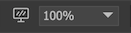 Set the stage scale, background color, guides, etc. In addition to adjusting the stage scale through the drop-down box here, you can also use the following methods:
- Ctrl / Cmd while scrolling the mouse wheel;
- Use the shortcut Ctrl / Cmd + plus or minus sign;
- Use shortcut Ctrl + 1 to restore 100% ratio. Click the left screen icon to pop up the following dialog box:
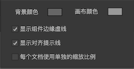
background colorThe background color of the stage.Canvas colorThe background color of the component. If the component needs a distinctive background color, it can be set in the component properties.Display component edge dotted lineThe outline of the component is shown in the document with a dashed line.Show alignment hint lineWhen moving or changing the size of the component, if the top, bottom, left, and right edges of the component are aligned with other components, there will be a green prompt line.Use separate scaling for each documentIf unchecked, all documents share the zoom setting; if checked, each document uses a separate zoom setting, for example, when editing document A, set the document zoom to 80%, switch to edit document B, and zoom The ratio is automatically restored to 100%, and then switched back to Document A, and the zoom ratio is automatically restored to 80%.
-
 Switch the branch of the current project. Click the icon on the left to open the branch settings dialog.
 -
 Switch the language of the current project. Click the icon on the left to open the language setting dialog.
Resource Library
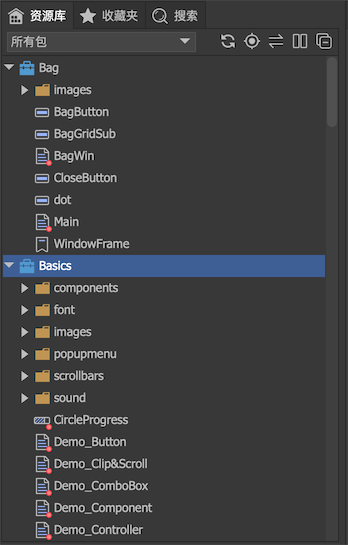
The tree view is used in the repository view. The top-level nodes are packages, and folders can be created under each package.
General operation
-
ImportDrag images, sounds, movieclips, text and other materials from the file manager / vista to the resource library to complete the import of resources. You can also place the material directly into the package directory and click the refresh button. Supports copying packages of other projects directly into the assets directory. -
mobileResources can be dragged freely between various folders or packages without breaking the reference relationship between resources. Folders can also be dragged. -
Rapid positioningWhen the focus is on the library view, press the letter continuously on the keyboard to quickly locate the resource with the specified name in the current directory.。 For example, if you press abc continuously, you will locate the first resource whose name starts with "abc"; if it is a Chinese character, you only need to press the first letter of Pinyin. For example, if you continuously press csb, you locate the first resource whose name starts with "test package". -
RenamePress F2 to modify the resource name.
toolbar
-
 Check all packagesPackage.xml to see if it has been modified externally, and if so, reload the package; check all in the file system at the same time****Opened packages. If any resources are placed in the package directory but are not in the package, they are imported into the package.
 -
 Locate the component corresponding to the currently active document in the library.
 -
 Connect with the editor. After activating this function, when the active document is switched, the component corresponding to the active document will be selected in the library at the same time.
 -
 Switch between two column views. The library view supports two structures, single column and two columns. A single column is a traditional tree structure; two columns are composed of a tree on the left and a list on the right.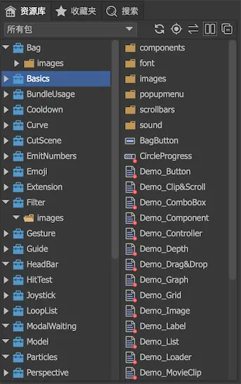
-
 All shrink.
Context menu
-
PropertiesModify the properties of resources, and support multiple selection of images and movieclips. For example, after selecting multiple images, click Properties and the following dialog box will pop up: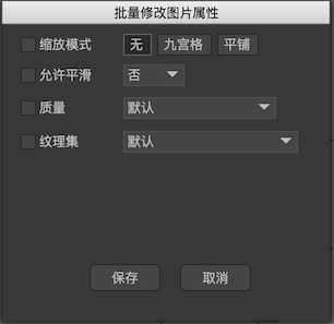
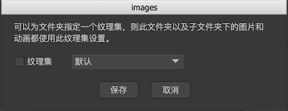
This function is also valid for folders. After selecting the folder, click Properties and the following dialog box will pop up:
-
CopyCopy the selected resource. Tip: Copy and paste functions support cross-projects. After opening two projects at the same time, you can copy and paste each other. -
Move toAfter clicking, a dialog box will pop up for selecting the destination of the movement. -
PastePaste copied content and themReferenced unexported resourcesTo the current position. If there is the same name when pasting, there will be such a prompt: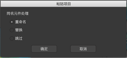
RenameRename a resource with the same name.replaceOverwrite a resource of the same name.jump overNo paste operation is performed. If the pasted content contains a reference to the resource, the reference is modified at the same time. Example: We are now going to paste component A and image B, and image B is placed in component A. The pasted destination already contains the resource dest / B of the same name. If you choose to skip, only the component A is pasted, and in the new A component, the B image corresponds to dest / B.
-
Paste allPaste copied content and themAll resources referencedTo the current position. -
Update resourcesReplaces the currently selected resource with a new resource. Files can also be replaced directly in the file manager / vista, which is suitable for batch operations. -
Set to exportSet the resource to export. Each resource in the package has an attribute of whether to export it,Exported assets have a small red dot in the lower right corner。 A package can only use resources that are set as exported by other packages, and resources that are set not to be exported are not accessible. At the same time, only components set to export can be dynamically created using code. -
Open in File ManagerLocate the selected resource in the file manager (or access). Note that if the resource path contains spaces, the positioning may fail. -
Create branchSee detailsBranch functionIntroduction.
Package group
When there are more packages in the library panel, finding things is more troublesome. The editor provides the ability to group packages.
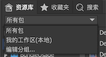
Click Edit Group to display the dialog box:
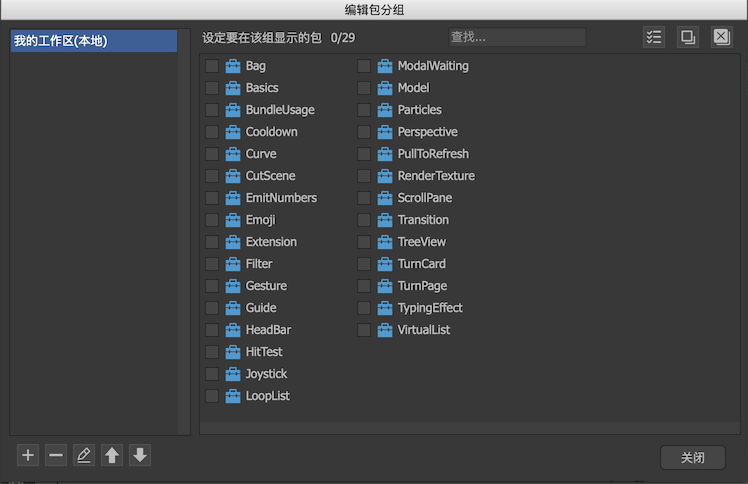
The list on the left can be added, deleted, modified, and the display order adjusted; the list on the right selects the packages in the group. In particular, ** My Workspace (Local) ** is a special group. This group cannot be deleted or renamed. Its settings are saved in the user's local machine and will not be saved in the project's settings. Team sharing. It is designed to record personal work tasks.
Favorites
Favorites provides a quick access to frequently used components. You can put some commonly used components or resources in favorites for quick access.
Context one or more resources in the resource library and select "Add to Favorites" from the context menu to add the resources to favorites.
Display list
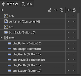
Shown here is a display list of components. Arranged in display order, the lower the component in the list, the more advanced. You can drag and drop change elements directly in the list to change their position in the display list.
 Expand or collapse all groups
 Rename the currently selected component
 Shield display controller. After shielding, all content hidden by the display controller will be displayed. Reference here。
 Shield relation systems. After shielding, when the component coordinates and dimensions are manually modified, the relation system will not work. For example, A correlates the position of B, and you want to move B closer to A, but the distance between B and A is always the same due to the role of the correlation system, so it is difficult to complete the operation. At this time, you can block the related system to operate. After the operation is complete, remember to unblock it.
 Hide components. Click the toolbar button to hide all components, and click the dots corresponding to each row to hide the specified components. This hidden feature is an editing aid that does not affect runtime UI performance. For example, one component covers another component. You can use this function to temporarily hide the component above.
 Locking element. Click the toolbar button to lock all components, and click the dot in the corresponding position of each row to lock the specified components. This lock function is an editing aid and does not affect the UI performance at runtime. For example, some components do not want to change the position or size by mistake during editing, so they can be locked.
Transitions
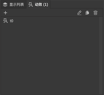
Shown here is the transition list of the component.
 Create new transition. Enter the component immediately after creation Edit Transition。
 Rename transition.
 Copy transition. The copied transition list will add a new transition with exactly the same content.
 Delete transition.
Timeline
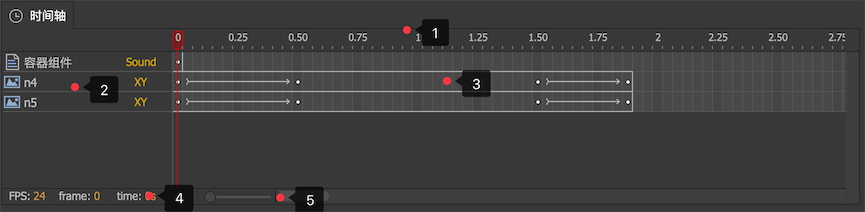
- Timeline and playhead position. The unit of time display is seconds.
- The various components and attributes involved in animation. The component name and type are shown on the left, and the property names are shown on the right. To add a new item here, click the symbol on the stage and select Properties from the pop-up context menu.
- Timeline of each attribute.
 Represents a keyframe,
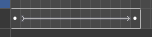 Represents the use of interpolation animation between two key frames,
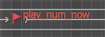 A small red flag indicates that this key frame has a Label, which can be accessed by code by name.
 - Information display area.
- Timeline zoom in / out. Drag to the right to increase the editable length of the timeline. For example, when the slider is on the far left, the timeline only displays a maximum of 30 seconds. If you want to make a few minutes of content, you can drag the slider to the right.
Timeline operation:
Single selectionLeft mouse click on a frame.Multiple selectionHold CTRL to increase selection, and SHIFT to select a range. Or press the left mouse button directly in the blank space without releasing and then move to select a range.dragDrag the selection directly to another location. As shown in the following animation: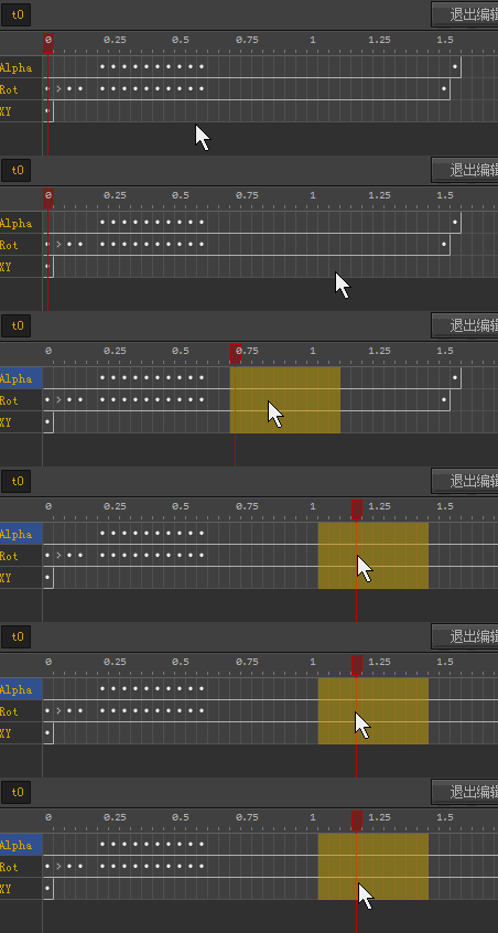
Context menu:
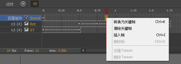
Convert to keyframeConvert the current frame to a key frame.Clear keyframeTurn key frames into normal frames.Insert frameInsert a frame, the shortcut key is Ctrl + I, and the key frames after the frame are moved backward in order.Delete frameTo delete a frame, the shortcut key is Ctrl + D. The key frames after the frame are moved forward one by one.Create TweenCreate a Tween between two keyframes.Remove TweenRemove Tween between two keyframes.
Context menu 2:
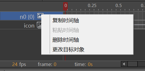
Copy timelineCopy the timeline.Paste timelinePaste the copied timeline into the selected timeline. The source and target should have the same attributes.Delete timelineDelete the selected timeline.Change targetModify the target of the timeline.
Reference
Query the situation where a resource is referenced by other resources, or the situation where a resource references other resources. And you can replace references in the query results.
In the resource library view, you can activate the reference view after selecting a resource and selecting "Query Dependencies" from the context menu.
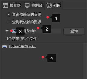
Query depends on my resourcesQuery the resources I rely onThe latter is typically used for components.- You can drag in the resources you need to operate here.
- Click the drop-down arrow to switch to replace mode. After clicking, the following interface appears:
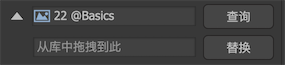 Drag the resource you want to replace in the input box below and click Replace. Note that you must query before replacing.
 - List of query results.
Search
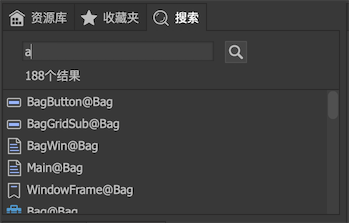
Enter keywords to search for resources that have keywords in their names. Keywords are not case sensitive.
Console
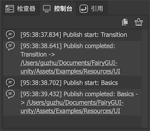
Displays prompts, warnings, and error messages output by the software.
 Prompt message.
 Warning message. This kind of information does not affect the normal use of the software, but it is recommended to solve the problem according to the information.
 Error message. It is recommended that such information be reported to developers through the community.
Preview
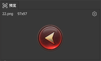
The preview interface displays thumbnails of the selected assets in the current asset library.
Click on the upper right corner The following menu pops up:
Generate previews for componentsYou can switch whether to generate thumbnails for the component. On some low-profile computers, this function can be cancelled to improve the software running speed.
Inspector
Click any one or more components in the stage, and the corresponding properties panel will be displayed on the right side of the editor. If you click in the empty space of the stage (with nothing selected), the properties panel of the container component is displayed.
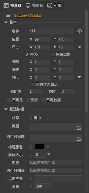
We will introduce the meaning of attributes here in detail when we introduce the usage method of each resource type.
Document view
Side toolbar
 Select the mode.
 Free scroll mode. In particular, in the selection mode, press and hold the space to temporarily switch to the free scroll mode, and release the space to return to the selection mode.
 Text control.
 Rich text control.
 Graphic controls.
 List control.
 Loader control.
 Creates a combination for the currently selected component.
 Cancel the current combination.


 对齐操作。 After selecting multiple components, click the button here to execute the corresponding alignment function. For example, after selecting two components and clicking left and right to center, the two components will be set to centerline alignment. If only one component is selected, the component performs the corresponding alignment function on the container component。 For example, after selecting a component and clicking Align Left and Right, the component will move to the middle position of the container component. As another example, after selecting a component and clicking the same width, the width of the component will be set to the same as the container component.


 The selected components can be arranged in uniform row spacing, uniform column spacing, or table.
Controller toolbar

Click the plus sign to add a new controller. Click the controller name to enter the controller editing interface. Click each page button of the controller to switch pages.
stage
The stage is the editing area of the component. To add content to the stage:
- On the side toolbar, click Basic Controls, and then click Stage.
- Drag assets directly from the library or favorites to the editing area.
- You can directly paste text or images from the clipboard. If it is a image, it will be imported into the asset library and then automatically placed on the stage.
- You can drag resources directly from the system's file manager or access. If the resource is located in the assets directory, that is, the resource in the package, the resource will not be repeatedly imported into the resource library.
The center color is different from the surrounding color in the main display area of the component. Although you don't need to place everything in the component area, because by default, content beyond the component area will still be displayed, but the size of the component is only determined by the component area, and it does not calculate the enclosing of all children. Some special functions, such as filters, only work in the component area, so it is recommended to place the content in the component area as much as possible.
Common stage operations are:
-
SelectedClick on a component to select a single item, hold down SHIFT and click on multiple components to select multiple items. Click on the blank space to cancel all selections. Press and drag in the blank space to select the frame. -
mobileHold down the component and drag. If you hold down SHIFT while dragging, the movement is limited to the vertical or horizontal direction. Use the up, down, left, and right arrow keys on the keyboard to move the selected component. Each press moves 1 pixel. If you press the SHIFT key at the same time, the movement speeds up and moves 10 pixels each time. -
ZoomDrag the 8 handles on the edge of the selected box to change the width and height of the component. If you hold down the SHIFT key while dragging the handle, the aspect ratio is forcibly maintained. -
combinationWith multiple components selected, press CTRL + G to create a combination.
Stage context menu:
-
Swap positionSwaps the selected two components. -
Replacement componentYou can replace the currently selected component with another component, and all attributes such as position and size will be retained. -
Convert to componentYou can replace the currently selected one or more components with a separate component. The content of this component contains the selected content, and the selected content is cleared. -
Convert to bitmapYou can replace the currently selected one or more components with a separate image, the content of this image is drawn from the selected content, and the selected content is cleared. The generated images are automatically added to the resource library. -
Show in galleryHighlight the currently selected component in the library.
Test interface
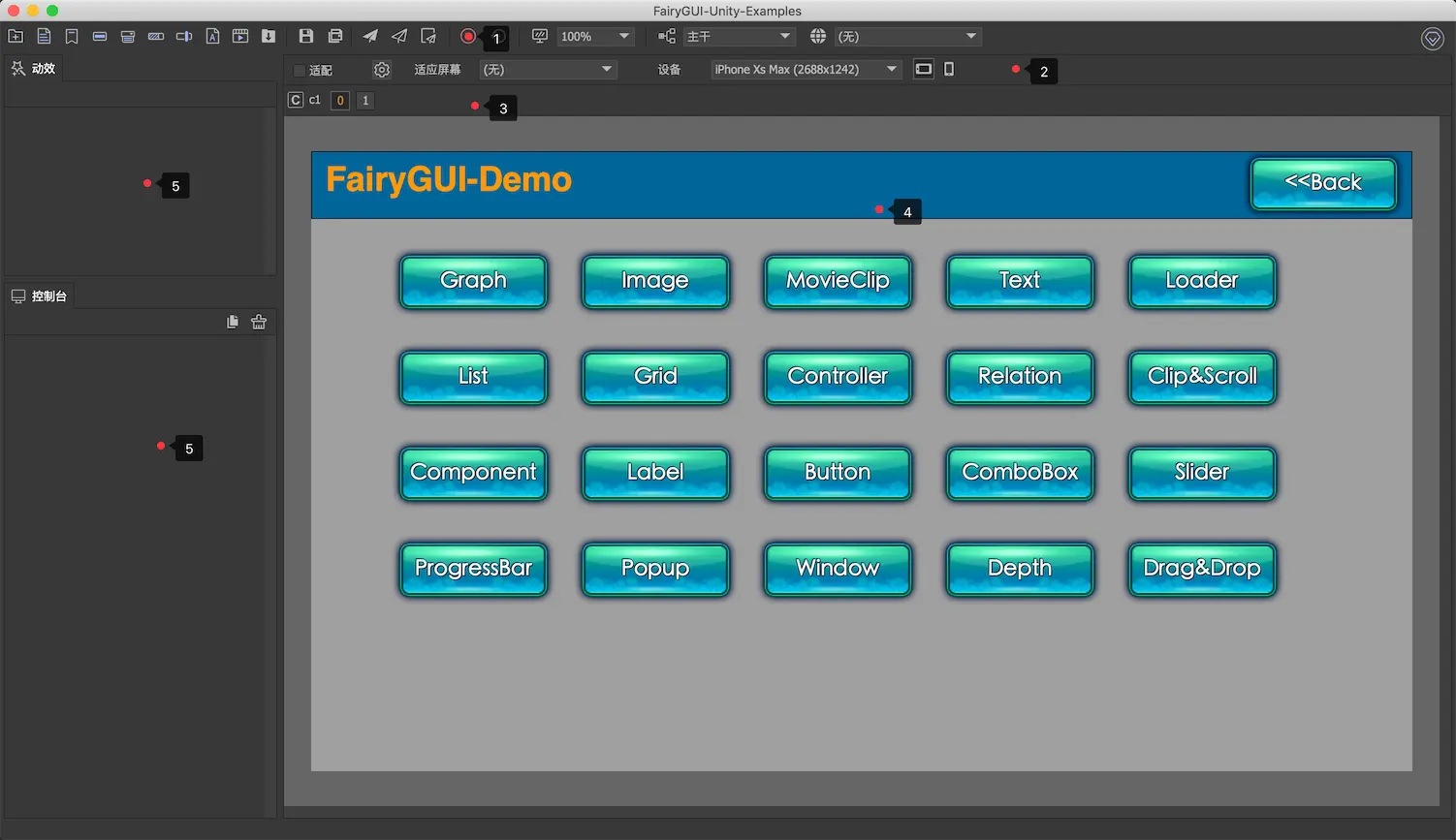
The test interface consists of the following parts:
- Click here to exit test mode.
- Where to set the adaptation test parameters.
- Controller list. Click each page button of the controller to switch pages.
- Here is how the component will look when run.
- Individual function views. Users can drag them to different locations according to their usage habits, or close them. Context the panel title bar and select Close from the context menu. If you want to open it again, go to "Main Menu-> View". The animation view and console view are displayed by default in test mode.
Adaptation test

- If the currently designed component needs to be tested for adaptation, you can check the "Adaptation Test" option.
- Open the setting of global adaptation parameters. Should be performed before the first use of the adaptation testSetting of global adaptation parameters。
- Adapt to screen settings. Note: The settings here are only used for adaptation testing. In actual operation, the top-level components are in size and position, and need to be set in code.
full screenThis means that the component fills the screen. At this time, the component size is equal to the logical screen size.Adapt to height, center left and rightAdjust the width of the component based on the ratio of the height of the component to the height of the logical screen. For example, if the height of the component is 1/2 of the height of the logical screen, and the height of the component after the adaptation is equal to the height of the logical screen (magnified 2 times), the width of the component is also set to 2 times the width of the logical screen. Regardless of whether the horizontal direction is insufficient or overflowing, the position of the component is set in the center of the logical screen.Adapt to width, center up and downAdjust the height of the component based on the ratio of the width of the component to the width of the logical screen. For example, if the width of the component is 1/2 of the logical screen width, and the width of the adapted component is equal to the logical screen width (2x magnification), the height of the component is also set to twice the logical screen height. Whether the vertical direction is insufficient or overflowing, the position of the component is set in the center of the logical screen.
- Tested equipment. Tip: You can do this in the "Project Settings-Adaptation Test-Equipment Configuration"Add other equipment.
- Switch between landscape and portrait.
Please note when adapting the test: If you change the screen size during the dynamic effect playback, and this dynamic effect involves components with adaptive settings, the dynamic effect may play abnormally. Please don't change the screen size during the animation.