List
Lists are a special extension of components. Click on the side toolbar Button to generate a list.
List properties
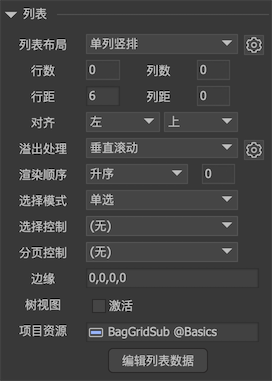
Click a list on the stage, and the property bar on the right shows the properties of the list:
-
List layoutThere are currently five supported lists.Single rowOne item per line, arranged vertically.Single lineOne item per column, arranged horizontally.Lateral flowThe items are arranged horizontally in order. The right edge of the bottom viewport or the specified number of columns is reached, and the automatic line wrapping continues.
-
Vertical flowThe items are arranged vertically in sequence, bottom edge of the viewport or reaches the specified number of rows, return to the top and open a new column to continue the arrangement. -
PaginationViewport width x viewport height as a single page size, each page is arranged horizontally. In each page, the items are arranged horizontally in order, and the right edge of the bottom viewport or the specified number of columns is reached, and automatic line wrapping continues. When the new line exceeds the viewport height or reaches the specified number of lines, it advances to the next page. Note that pagination is just the way the list is arranged. It does not mean that the list is scrolled by page. Pagination scrolling needs to be set in the scroll properties. -
Number of lines``Number of Columns This option is only valid for horizontal flow, vertical flow, and paged layouts. If it is not specified (set to 0), the line will be wrapped until the edge, otherwise, the number of each line must reach the set value before the line is wrapped. -
Line spacing``Column distance The distance between each row / column. Can be negative. -
AlignedThe alignment of the list in landscape and portrait. Note that there are preconditions for the application of alignment. For example, if the list is a single-column layout and "Automatically adjust list item size" is set, then the item always fills the list width automatically in the horizontal direction, so the horizontal alignment has no effect. -
Overflow handlingIndicates how to handle content that exceeds the rectangular area of the list. -
visibleIndicates that content beyond the rectangular area of the list remains visible. -
hideIndicates that content beyond the rectangular area of the list is not visible, which is equivalent to applying a rectangular mask to the list. -
Vertical scrollHorizontal scroll``Free scrolling detailed inRolling container。 Note: The "layout" and "overflow handling" of the list are independent settings. If the two do not match, the expected effect may not be achieved. For example, for a single-line list, if you select "Scroll Vertically", scrolling has no effect. -
Rendering orderDefines the relationship between the display order of items and the order in its list. Detailed instructionsRendering order -
Ascending orderThis is the default behavior. The larger the item index, the more advanced it is. -
DescendingThe smaller the item index, the earlier it is displayed. -
ArchedCustomize an index that is displayed at the front, such as 2, the third item is displayed at the front, and items that are arranged in front of it and the items that are behind are displayed in order. -
Select modeSupports four selection modes: none, single selection, multiple selection (using the shift key), and multiple selection (click to select). ** item has a prerequisite to participate in the radio. It must be a radio button. If it is not a radio button, it will not participate in the selection mode. ** Single selection means that only one item can be selected at a time; multiple selection allows multiple selections. There are two ways to operate multiple selections. One is to use the shift key for multiple selections. Not suitable for mobile devices; the other is that each item is clicked to select it, and then clicked to deselect it, without the support of the keyboard. -
Selection controlYou can bind a controller. In this way, when the selected item in the list changes, the controller also jumps to the page with the same index at the same time. Vice versa, if the controller jumps to a certain page, the list also selects the items with the same index at the same time. -
Paging controlYou can bind a controller. When the list page is scrolled (the overflow processing must be one of the three types of scrolling, and the scrolling must be checked as the page mode), the controller also jumps to the page with the same index (page number) at the same time. Vice versa, if the controller jumps to a page, the list also scrolls to the same index (page number). -
edgeLeave blank around the list. Generally used when the "overflow processing" is "hidden" or "scrolling".Edge blurCurrently only supported on the Unity platform. If the list is clipped to the content, it can produce a blurred effect at the edges and enhance the user experience. This value should be relatively large to see the effect, such as 50. -
Tree viewWhen checked, the list will use a tree structure to organize its contents. Please refer to the tree。 -
Project resourcesThis sets the item type used by default for the list. But FairyGUI's list can support a variety of resource mixing, not just a single item type.
Click After the secondary interface pops up:

-
Automatically resize list itemsIf checked:- The list layout is a single column, the width of the list items is automatically set to the width of the list display area;
- The list layout is a single line, and the height of the list item is automatically set to the height of the list display area;
- When the list layout is horizontal and the number of columns is set, the width of the list items in each row is automatically adjusted to make the row width equal to the width of the list display area;
- When the list layout is vertical flow and the number of rows is set, the height of the items in each column is automatically adjusted to make the row height equal to the height of the list display area;
- The list layout is pagination, and rules 3 and 4 are applicable.
-
Collapse hidden itemsIf checked, when an item is not visible (visible = false), the list will not leave a place for him, that is, the item will be ignored during typesetting; if not checked, the place will be reserved for the item in the list, showing the effect Just a blank placeholder. API 是 foldInvisibleItems。 -
Automatically scroll to all visible when clicking on an itemWhen checked, when an item is clicked, if the item is partially displayed, the list will automatically scroll to the entire item and display complete. If your list has items that exceed the list viewport size, it is recommended not to check it, otherwise the behavior will be weird. The API is scrollItemToViewOnClick.
Click "Edit List" to display the dialog box:
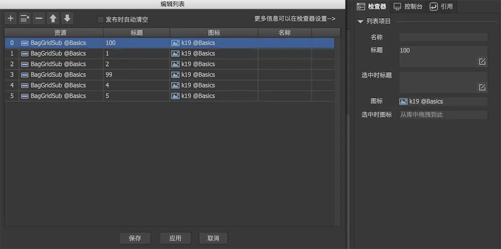
Click Add to add an item specified by "Project Resources". If your list requires multiple resources to be mixed, you can add an item first, and then drag components from the library to the "Resources" column to replace the default resources.
The title, icon, and name attributes of the item can be edited in the table. For other attributes, you can select the item and modify it in the inspector on the right.
"Automatically clear when publishing" means that the list data edited here will not be included in the publishing results when it is finally published, that is, the list data is only used for editor preview purposes.
GList
Manage list content
The corresponding type of the list is GList. In FairyGUI, the essence of a list is a component. GList is also derived from GComponent, so you can use GComponent's API to directly access the contents of the list. For example, you can use GetChild or GetChildAt to access the items in the list; you can also use AddChild to add An item. This part of the API can refer to GComponentDisplay list management。
When you add, delete, or modify a list, the list is automatically sorted and refreshed without calling any API. During the automatic arrangement, the coordinates, size, and depth of the items are set according to the layout of the list, so do not set the position of the items yourself, or set the sorting order to try to control the depth of the items. With one exception, the vertical layout list will only set the item's y coordinate automatically. If you need the item to have a horizontal displacement effect, you can still modify the item's x value. The same goes for horizontal layout.
This permutation and refresh occurs before drawing this frame. If you want to immediately access the correct coordinates of the item, you can callEnsureBoundsCorrectTell GList to reorder immediately. EnsureBoundsCorrect is a friendly function, you don't need to worry about the extra performance cost of repeated calls.
In practical applications, the contents of the list are frequently updated. The typical usage is to clear the list when background data is received, and then add all items again. If you create and destroy UI objects every time, it will consume a lot of CPU and memory. Therefore, GList has a built-in object pool.
Management method of display list after using object pool:
-
AddItemFromPoolRemove from the pool (if any) or create a new object and add it to the list. If you do not use parameters, the settings of the "Project Resources" of the list are used; you can also specify a URL to create the specified object. -
GetFromPoolRemove from the pool (if any) or create a new object. -
ReturnToPoolReturn the object to the pool. -
RemoveChildToPoolDelete an item and return the object to the pool. -
RemoveChildToPoolAtDeletes an item at a specified location and returns the object to the pool. -
RemoveChildrenToPoolDelete a range of items, or delete all, and return the deleted objects to the pool
You should be smart enough to know that AddItemFromPool = GetFromPool + AddChild, RemoveChildToPool = RemoveChild + ReturnToPool.
When applied to the pool, we should be very careful. A constantly growing pool will be a disaster for the game, but if the pool is not used, it will also affect the performance of the game. Here are some examples of incorrect usage:
Error example 1:
GObject obj = UIPackage.CreateObject(...);
    aList.AddChild(obj);

    aList.RemoveChildrenToPool();
The pool is not used when adding objects, but is placed in the pool when the list is finally cleared. This code continues to run, the object pool will continue to grow, which may cause memory overflow. Correct way: Objects should be created from the pool. Change AddChild to AddItemFromPool.
Error example 2:
for(int i=0;i<10;i++)
        aList.AddItemFromPool();

    aList.RemoveChildren();
10 items were added here, but their references were not saved when they were removed, and they were not put back in the pool, which caused a memory leak. Change aList.RemoveChildren to aList.RemoveChildrenToPool ();
** Removal and destruction are two different things. ** When you remove an item from the list, it should be destroyed if it is no longer used; if you still need it, please save its reference. But if you put it in the pool, do not destroy the item anymore。
Modifying the list with a callback function
When adding a large number of items, in addition to the circular method AddChild or AddItemFromPool, you can also use another callback method. First define a callback function for the list, for example
void RenderListItem(int index, GObject obj)
    {
        GButton button = obj.asButton;
        button.title = ""+index;
    }
Then set this function to the list rendering function:
// Unity / Cry / Mono Game
    aList.itemRenderer = RenderListItem;

    // AS3
    aList.itemRenderer = renderListItem;

    // Egret
    aList.itemRenderer = renderListItem;
    aList.callbackThisObj = this;

    // Laya. (Note that the last parameter must be false!)
    aList.itemRenderer = Handler.create (this, this.renderListItem, null, false);

    // Cocos2dx
    aList-> itemRenderer = CC_CALLBACK_2 (AClass :: renderListItem, this);

    // CocosCreator
    aList.itemRenderer = this.renderListItem.bind (this);
Finally, directly set the total number of items in the list, so that the list will adjust the number of objects in the current list container, and then call the callback function to render the item.
// Create 100 objects. Note that numChildren cannot be used here. NumChildren is read-only.

    aList.numItems = 10;
If the number of newly set items is less than the current number of items, the extra items will be put back into the pool.
Using the list generated in this way, if you need to update an item, you can call RenderListItem (Index, GetChildAt (Index)) by yourself.
List autosize
Strictly speaking, lists don't have auto-size capabilities. But GList provides API to set the list size according to the number of items. After you have filled the data of the list, you can call GList.ResizeToFit, so that the size of the list will be modified to the most suitable size to accommodate the specified number of items. If you do not specify the number of items, the list is expanded to show all items.
Event
Click on an item in the list to trigger the event:
// Unity / Cry / MonoGame, EventContext.data is the item object that is currently clicked
    list.onClickItem.Add (onClickItem);

    // AS3, ItemEvent.itemObject is the currently clicked object
    list.addEventListener (ItemEvent.CLICK, onClickItem);

    // Egret, ItemEvent.itemObject is the currently clicked object
    list.addEventListener (ItemEvent.CLICK, this.onClickItem, this);

    // Laya, the first parameter of the onClickItem method is the currently clicked object
    list.on (fairygui.Events.CLICK_ITEM, this, this.onClickItem);

    // Cocos2dx, EventContext.getData () is the item object that is currently clicked
    list-> addEventListener (UIEventType :: ClickItem, CC_CALLBACK_1 (AClass :: onClickItem, this));

    // CocosCreator, the first parameter of onClickItem is the currently clicked object, and the optional second object is fgui.Event.
    list.on (fgui.Event.CLICK_ITEM, this.onClickItem, this);
As can be seen from the above code, the current click object can be easily obtained in the event callback. If you want to get the index, you can use GetChildIndex.
Virtual list
If the number of items in the list is particularly large, such as hundreds or thousands, creating a display object of an entity for each item will consume time and resources. FairyGUI's list has a built-in virtual mechanism, that is, it only creates entity objects for items within the display range, and implements large-capacity lists by dynamically setting data.
There are several conditions for enabling virtual lists:
- Need to define itemRenderer.
- Scrolling needs to be turned on. Overflow handling is not scrolling and the list cannot be virtualized.
- Need to set up the "Project Resources" of the list. Can be set in the editor, or you can call GList.defaultItem settings.
After the conditions are met, the virtual function of the list can be turned on:
aList.SetVirtual ();
Tip: The virtual function can only be turned on and cannot be turned off.
The performance of the virtual list is closely related to the processing logic of itemRenderer. You should try to simplify the logic inside. Coroutines, IO, and high-density calculations should not appear here. Otherwise, there will be stuttering. If you need to initiate an asynchronous operation in itemRenderer, do not let the asynchronous operation save the ITEM instance, and modify the ITEM instance directly in the callback. The correct method is to let the asynchronous operation save the ITEM index. After the asynchronous operation is completed, check whether the ITEM of this index is checked. If there is a corresponding display object, update if there is one. If not, discard the update. In addition, the itemRenderer should not have operations such as new that will cause GC, because the itemRenderer will be called very frequently during the scrolling process.
In the virtual list, ITEM is reused. When an ITEM needs to be refreshed, the itemRenderer will be called. You don't need to care about the timing of this call, nor can you rely on this timing. Please note that if you use Add to listen for events in itemRenderer,Never use temporary functions or lamba expressions。 The following example illustrates this.
C # reference:
void EventCallback()
    {
    }

    EventCallback0 callback = EventCallback;

    void OnRenderItem(int index, GObject obj)
    {
        GButton btn = obj.asCom.GetChild("btn").asButton;

        //错误! Temporary functions will cause multiple callbacks to be added. Lua uses "function () end" similarly.
        btn.onClick.Add (() => {});

        // Yes, the same method will only be added once. But using the method name directly will generate tens of B of GC.
        btn.onClick.Add (EventCallback);

        // Correct, callback is a cached proxy instance and does not generate GC.
        btn.onClick.Add (callback);

        // Correct, use Set to ensure that it will not be added repeatedly.
        btn.onClick.Set (callback);

        //error! , You cannot use onClick.Set for ITEM, you need to use GList.onClickItem
        obj.onClick.Set (EventCallback);
    }
AS3 / Starling / Egret / Laya Reference:
//
    private function EventCallback (evt: Event): void
    {
    }

    private function onRenderItem (index: int, obj: GObject): void
    {
        var btn: GButton = obj.asCom.getChild ("btn"). asButton;

        // Error, temporary functions should not be used here
        btn.addClickListener (function (): void (});

        // correct, the same method will only be added once
        btn.addClickListener (EventCallback);
    }
In the virtual list, the number and order of display objects and items are inconsistent. The number of items can be obtained through numItems, and the number of display objects can be obtained through the component's API numChildren.
In the virtual list, it is necessary to pay attention to the distinction between the item index and the display object index. The value obtained by selectedIndex is the index of the item, not the index of the display object. AddSelection / RemoveSelection and other APIs also need the index of the item. The conversion of the item index and the object index can be completed by the following two methods:
// Convert the item index to the display object index.
    int childIndex = aList.ItemIndexToChildIndex (1);

    // Convert the display object index to the item index.
    int itemIndex = aList.ChildIndexToItemIndex (1);
When using virtual lists, we rarely need to access off-screen objects. If you really need to get the display object of an item at the specified index in the list, such as the 500th, because the current item is not in the viewport, for a virtual list, there is no corresponding display object for the object not in the viewport, You need to scroll the list to the target position first. E.g:
// Note here, because we want to access the object at the new scroll position immediately, the second parameter scrollItToView cannot be true, that is, no animation effect is used
    aList.ScrollToView (500);

    // Convert to display object index
    int index = aList.ItemIndexToChildIndex (500);

    // This is the 500th object you want
    GObject obj = aList.GetChildAt (index);
The essence of a virtual list is the separation of data and rendering. People often ask how to delete or modify the items of the virtual list. The answer is to modify your data first, then refresh the list. There are two ways to refresh the virtual list:
- Use numItems to reset the number.
- GList.RefreshVirtualList。
AddChild or RemoveChild is not allowed to add or delete objects from the virtual list. If you want to clear the list, you must set numItems = 0 instead of RemoveChildren.
The virtual list supports variable-size items. There are two ways to dynamically change the size of an item:
- Use item width, height, or SetSize inside the itemRenderer to change the size of the item.
- The item establishes an relation with the internal component, and then changes the content in the itemRenderer to trigger the change of the internal component, thereby automatically changing the item height. For example, item establishes a height-to-height relation with a variable-height text inside, so that when the text changes, the height of the item automatically changes.
In addition to these two methods, you cannot change the item size in other ways than itemRenderer, otherwise the virtual list will be arranged in disorder. But you can force the itemRenderer to be triggered by calling RefreshVirtualList.
A virtual list supports a mix of different types of items. First define a callback function for the list, for example
// Returns different resource URLs based on different indexes
    string GetListItemResource (int index)
    {
        Message msg = _messages [index];
        if (msg.fromMe)
            return "ui://Emoji/chatRight";
        else
            return "ui://Emoji/chatLeft";
    }
Then set this function as the item provider for the list:
//Unity/Cry
    aList.itemProvider = GetListItemResource;

    //AS3
    aList.itemProvider = getListItemResource;

    //Egret
    aList.itemProvider = getListItemResource;
    aList.callbackThisObj = this;

    //Laya。 (Note that the last parameter must be false!)
    aList.itemProvider = Handler.create (this, this.getListItemResource, null, false);

    // Cocos2dx
    aList-> itemProvider = CC_CALLBACK_1 (AClass :: getListItemResource, this);

    // CocosCreator
    aList.itemProvider = this.getListItemResource.bind (this);
For lists with horizontal flow, vertical flow, and paging, unlike non-virtual lists, which have flow characteristics, the number of items in each row or column of a virtual list is fixed. When the list is initialized, a default item is created to measure this number. If you still need to typeset the number of items per row or column and must use virtualization, then you can insert some empty components or empty graphics for placeholders and set their width according to actual needs to achieve that kind of Typographic effect.
Loop list
A circular list is a list that is connected end to end. The circular list must be a virtual list. To enable the circular list:
aList.SetVirtualAndLoop().
The loop list only supports single-row or single-column layouts. It does not support flow layouts and page layouts. Because the loop list is connected end to end, specifying an item index may appear in different positions, so when you need to specify the rolling position, try to avoid using the item index. For example, if you need to scroll the list one space left / up or right / down, the best way is to call the ScrollPane API: ScrollLeft / ScrollRight / ScrollUp / ScrollDown The characteristics of the circular list are the same as those of the virtual list, and will not be repeated here.